Overview
Write SQL on mountains of Market Data
Introduction
Except for limit order book updates, we store all of our data in a PostgreSQL database. Users can query this database directly via an interface. For this, we're using Apache Superset, an open source business intelligence tool. For detailed information on how superset works and for an exploration of the full feature set on offer, you can visit their documentation. The guide shown here is specific to L3 Atom and will take you through some example use cases from start to finish.
Access
The service is hosted at query.shared.projectx.network.
Quickstart
Head to query.shared.projectx.network and you'll be redirected to a welcome screen.
There are two main ways you can interact with the platform, depending on your comfort level with writing SQL.
NoSQL
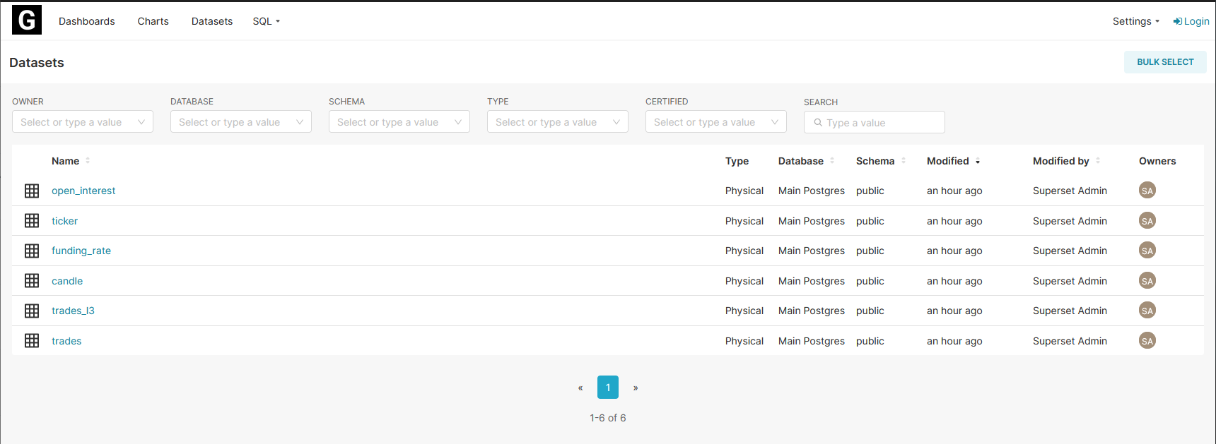
If you want to play around with an intuitive interface that lets you create visualisations on predefined datasets, click on Datasets.
From here you'll see a list of datasets on offer (note, these are 1-to-1 with what's in the Schema Reference). Clicking on any of these will take you to a screen where you can start to make a visualisation. You can also see some example virtual datasets that we've made that you can use as inspiration for writing your own queries.
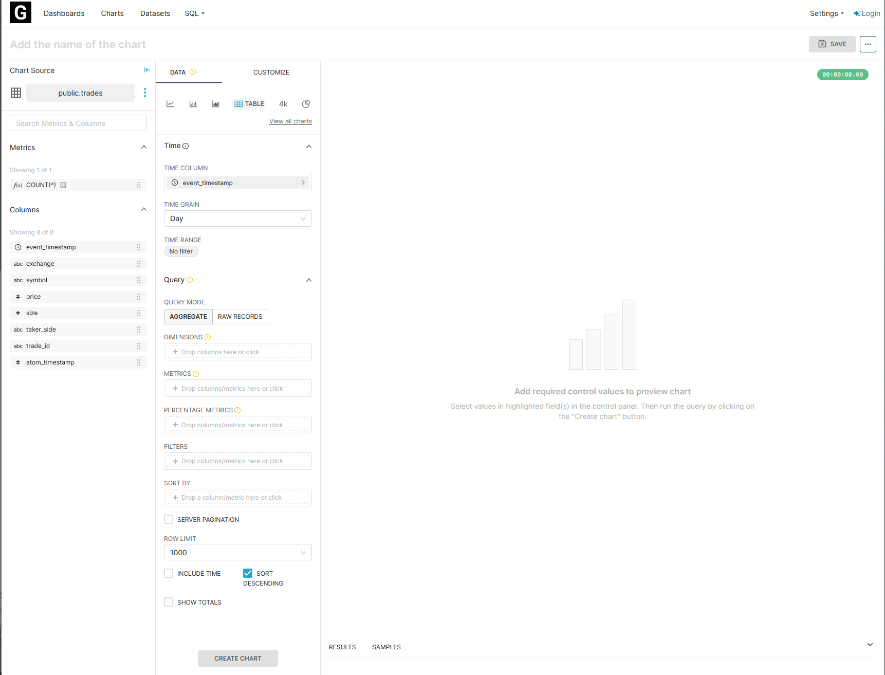
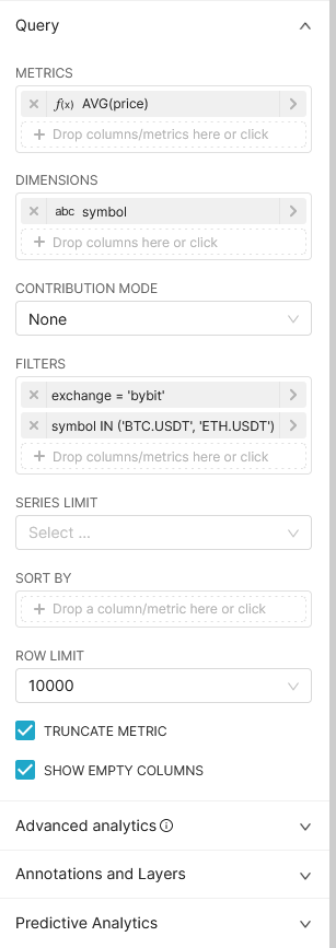
The example above uses the trades dataset. We have a limit of 10,000 rows that can be returned to you for any given query, so you're most likely going to want to make an aggregation function (or you can get raw data over a short period as a sample). There's a few things to notice here; on the left you can see a list of all the fields in the trades dataset, as well as an example aggregation metric that you can apply to one. To that right of that you can see the settings for modifying and preparing the data to be visualised. By default the event_timestamp for every event is used as the x-axis (most of the charts you will see are timeseries), and metrics are aggregated daily. You can change this to be weekly, hourly, by minute, or have no aggregation and get the most granular timestamped data. You can also specify a time range, which can limit results to be the past week, day, or something more specific.
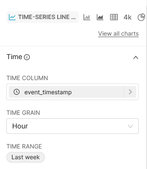
At the top you can specify what type of visualisation to create. By default this will be a table, but you can select from a variety of options. For this case, we'll use a time-series line chart, and set the metrics to aggregate hourly over the past week.
When constructing your query, you can specify parameters.
We'll go through the example above step-by-step. First, we say that we want to calculate the average price. That's done by either dragging in the price column from the left onto the metrics area and then selecting an aggregate, or by clicking on the metrics area directly. Similarly, we then specify that we want to add the symbol of the trade as a dimension. That's essentially breaking the data up into groups by symbol. We then add some filters, as currently our query will be getting a lot of data. We set the exchange to be bybit, and the symbol to be BTC.USDT or ETH.USDT. Looks pretty good, let's see what it looks like!
Click on Update Chart at the bottom to update your changes:
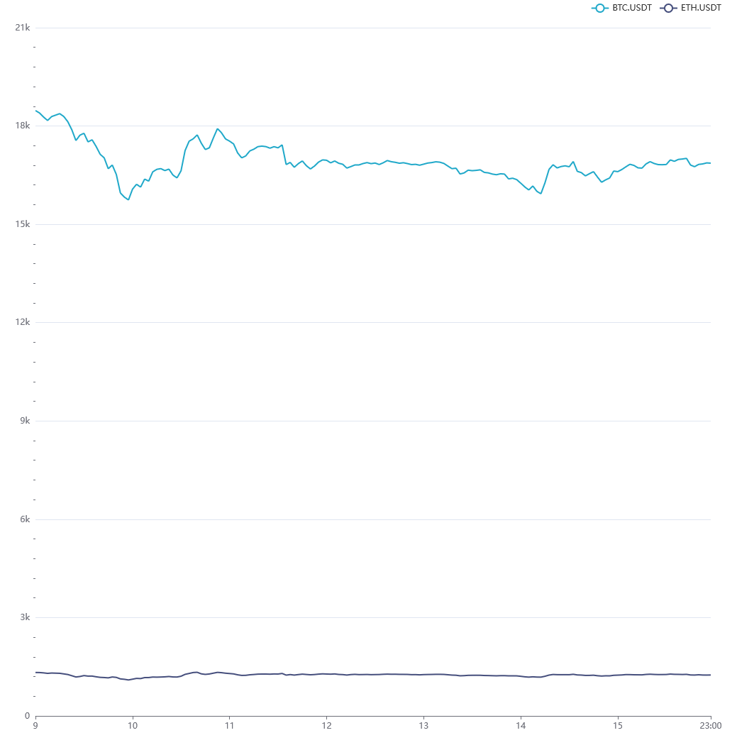
Give the query some time to process on our database, and then...
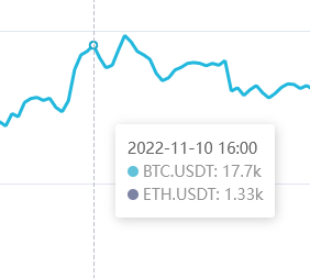
You should have your chart! There's a few interactions you can play around with once you have your chart up and running, firstly if you hover over a specific point in time, it'll show you the precise values at that point.
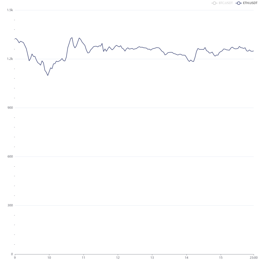
The legend at the top is also interactive -- if you wanted to get a closer look at ETH.USDT, you can toggle off BTC.USDT and the chart will automatically adjust to resize.
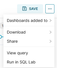
There's also plenty of customisation options under the CUSTOMIZE tab, and if you haven't changed the data, Superset should automatically cache the query for you. Since every user is currently anonymous, you won't be able to save the chart directly, however you can export it as a jpg, JSON, or CSV, see the raw SQL used to generate the chart data, and even share a permalink that others can use to fork your visualisation. All of this can be done from the three dots at the top right of the visualisation, next to the SAVE icon.
SQL
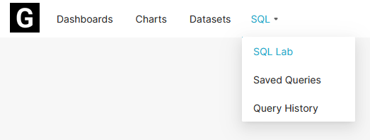
Under the SQL dropdown in the navigation bar, click on SQL Lab.
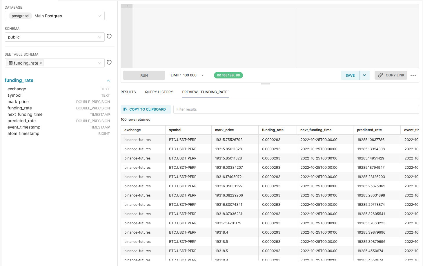
This will take you to a page where you can start to write raw SQL on our database (read only, of course). Select the schema as public, and you'll see a list of all the table schemas that are queryable. Clicking on one will automatically send a simple query to get the first 100 or so rows of data as a sample.
From here, you can write your query in the provided box, and run it with the RUN prompt. And that's it! Once you have a successful query you can turn it into a visualisation. This will be the same steps as shown in the NoSQL section above, except the dataset used for your visualisation will be of the returned values from your query, rather than the entire table.
Last updated